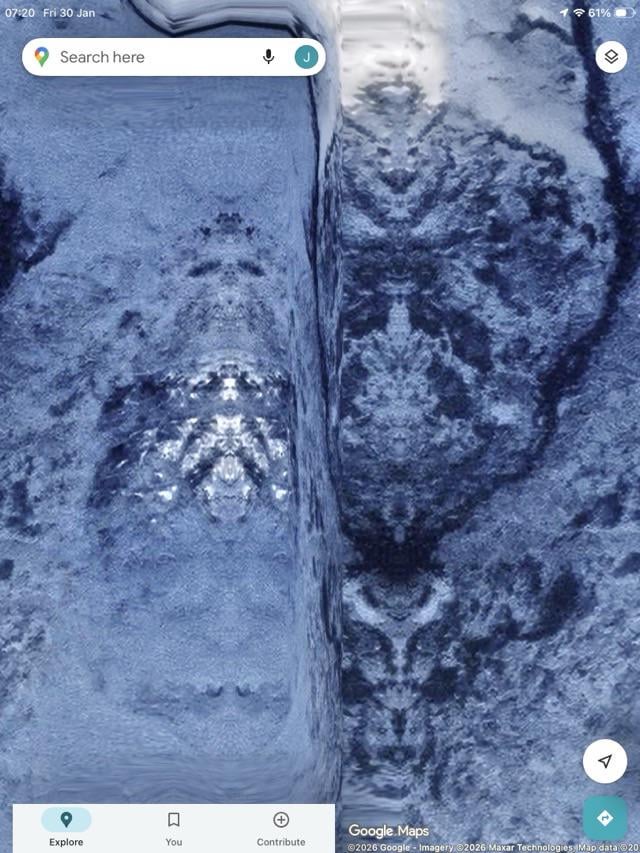
Share Facebook Twitter LinkedIn Pinterest Bluesky Threads Google map coordinates: 55°32'40.0"S 69°15'58.0"W by Johne1618
vpilled on January 30, 2026 7:37 am that’s just bad map stitching. there was a hole in the dataset and they filled it in with mirrored data.
Johne1618 on January 30, 2026 7:38 am [Goople map link](https://maps.app.goo.gl/TrMBTMUiLAwbV3sn8?g_st=ic)
cardinarium on January 30, 2026 7:43 am r/Pareidolia It does totally look like a dude—almost like one of those Jesus paintings where he’s holding a heart.
Mike_Hawk_Swell on January 30, 2026 7:50 am Im guessing it has something to do with google’s data in that region and why it looks wacky

5 Comments
that’s just bad map stitching. there was a hole in the dataset and they filled it in with mirrored data.
[Goople map link](https://maps.app.goo.gl/TrMBTMUiLAwbV3sn8?g_st=ic)
r/Pareidolia
It does totally look like a dude—almost like one of those Jesus paintings where he’s holding a heart.
Alien Goddess Burial.
Im guessing it has something to do with google’s data in that region and why it looks wacky