

A NASA satellite has photographed Indian cities after midnight for more than a decade. A Pune technologist finally decoded those images to trace which cities are undergoing real structural change, which are riding temporary booms, and what space-based data reveals that official economic statistics often cannot.
A NASA satellite has been photographing every Indian city after midnight since 2014. The pictures have sat on a public server the entire time.
This is about what one Pune developer has finally read in them, what those readings show about Indian cities that the government statistics do not, and the harder question they cannot yet answer.
On the night of 26 April 2025, ten days after the Pahalgam terror attack killed twenty-six tourists in Kashmir, the Suomi NPP satellite passed over Srinagar at approximately 1:54 in the morning local time. It photographed the city’s lights at the same brightness as the morning before, and almost the same brightness as the morning of 22 April when the attack happened.
Three hundred and twenty kilometres east, over Leh, the satellite recorded a city already dimming. By December, Srinagar’s lights would be down 0.6 per cent on the previous May. Leh’s would be down 9 per cent.
Both cities had received the same policy shock five years earlier — the revocation of Article 370 on 5 August 2019. Both received central money. Both, in the years since, had glowed steadily brighter from orbit. By 2025, Srinagar’s city centre was 88 per cent brighter than in 2014. Leh’s was 331 per cent brighter. Manali, included in the analysis as a control — similar geography, similar tourism dependence, no comparable policy shock — was 60 per cent brighter over the same period, steadily and unremarkably.
On the headline numbers, Leh was the runaway success. The trajectories after the April 2025 shock said something different. Srinagar’s growth was structural. Leh’s was not.
The data that says so was free, public, and almost nobody in India was reading it.
The signal
The instrument doing the looking is VIIRS — Visible Infrared Imaging Radiometer Suite — mounted on the Suomi NPP satellite jointly operated by NASA and NOAA. It passes overhead between approximately 1:30 and 2:30 in the morning local time, in India and everywhere else, and records how bright each 500-metre patch of ground is. NOAA bundles those observations into monthly composites and publishes them.
The current high-resolution series begins in 2014. Before VIIRS, the older DMSP-OLS sensor produced one image a year from 1992 to 2013; the upgrade turned an annual snapshot into a monthly one.
What VIIRS records is light. Not what is producing it. A village gets grid electricity for the first time. A military base goes up in a mountain valley and a few years later quietly winds down. A temple town is rebuilt from the inside. The sensor sees all of it. It does not know what it is seeing. It just records the brightness.
That indifference is the point. A government can publish whatever GDP figures it wants. It cannot make a city glow brighter from space.
The formal case for treating this signal as an economic proxy was established in 2012 by the economists Vernon Henderson, Adam Storeygard and David Weil. They found that changes in nighttime light correlate with real GDP changes at r = 0.88.
That r = 0.88 number deserves a moment of unpacking, because it will recur throughout. The correlation coefficient, r, is statisticians’ way of measuring how closely two things move together. It sits on a scale from -1 to +1.
– Zero means no relationship at all — knowing one tells you nothing about the other.
– A value of +1 means perfect lockstep: when one goes up, the other goes up by a proportional amount, every time.
– Anything above +0.7 is considered a strong positive relationship.
– Anything above +0.9 is essentially the two measurements telling the same story in different units.
Henderson’s 0.88 meant that nighttime lights and real GDP, across countries and decades, track each other closely enough that one can stand in for the other when the second is unavailable, delayed, or not entirely trusted. The numbers that show up later in this report— 0.917, 0.965, 0.977 — are stronger still.
Henderson and his colleagues also noticed something subtler. Lights respond to sustained changes in economic activity, not short-term fluctuations. Street lights and shop signs come on slowly as prosperity builds. They do not switch off when there is a bad quarter.
The World Bank now uses the signal to estimate output in countries with weak statistical systems. A small body of Indian research has extended the method to national, state and district level. The city level is where the work mostly has not been done — partly because reliable city-level GDP figures, the kind one would need to calibrate against, are scarce.
The accidental researcher
Abhijit Vaidya is a Pune-based technologist whose professional background is in building large-scale data systems. He came to this dataset by accident.
He was watching a podcast. The economist Ajay Shah was walking through work his team at xKDR had published on the Russia-Ukraine war. They had used nighttime lights — the same VIIRS composites, applied to the borders of a country being systematically destroyed — and found that Ukraine’s economic output had fallen to roughly half its pre-war level while Russia’s, despite sanctions, had barely moved.
What caught Vaidya’s attention was not the finding. It was what the xKDR team had done with it. They published everything. The code. The data. The methodology. Anyone with a laptop could replicate it.
So he did.
The replication, extended
Vaidya pulled the same VIIRS data from Google Earth Engine, applied the same FAO/GAUL country boundaries, used the same 100 nW/cm²/sr radiance cap. The xKDR paper had ended in January 2025. He ran it through March 2026 — 14 extra months.
The original findings held. Ukraine’s non-disputed regions are at 56 per cent of their 2019 baseline. The monthly series breaks cleanly in February 2022. Russia’s aggregate radiance has hovered between 117 and 144 per cent of 2019 throughout the war. Sanctions did not switch off the lights. The disputed regions — Donetsk, Luhansk, Kherson, Zaporizhia, Crimea — sit in between at around 70 per cent.
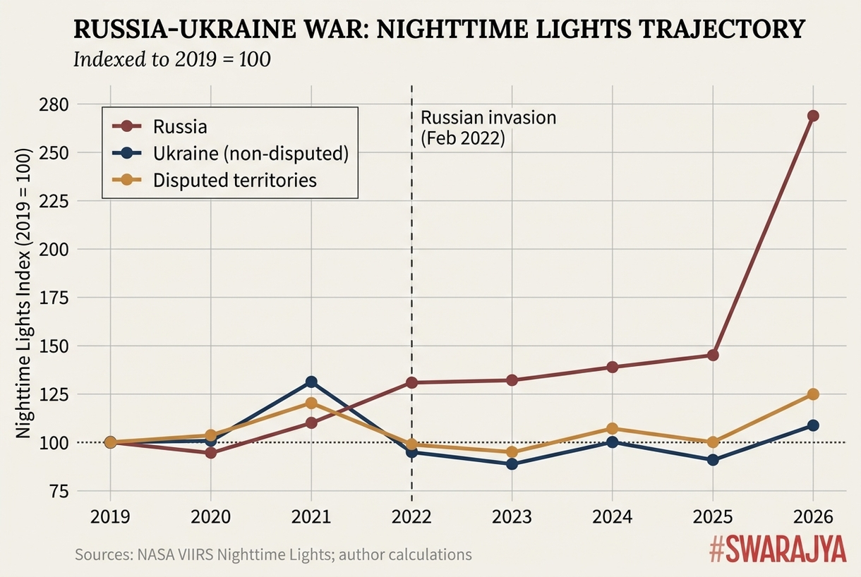
Three trajectories diverging from a 2019 baseline of 100. Ukraine’s non-disputed regions have not recovered past 108. The disputed territories sit at 125. Russia, after three years of flatness in the 130s, finished 2026 with a January reading 31 per cent above pre-war, and was still climbing.
The 14 extra months altered the picture in two specific places. Ukraine’s 2025 came in worse than 2024, down 30.6 per cent against pre-war compared to 23.7 per cent the year before. The partial recovery of 2024 reversed. December 2025 produced the lowest December reading since the invasion — almost certainly the work of intensified Russian attacks on energy infrastructure through winter 2025-26.
Russia’s January 2026 figure spiked unusually high. Vaidya assumed a data artefact. January 2026 had twice the usual number of cloud-free observations, which would make any city look brighter. He ran cloud-bias correction on the full Russia raster. The spike survived correction. The corrected figure is still 69 per cent above January 2025. Russia ended 2025 at 31 per cent above pre-war levels, and is still growing.
The “flat” characterisation in the original paper was accurate for 2022-24. It is not accurate anymore.
The replication did two things at once. It validated the methodology. And it produced a finding the original paper could not have made, because the data did not yet exist.
The sanity check at home
Before pointing this at places he had not been to, Vaidya pointed it at Pune, where he lives.
If the chart matched his window — steady growth, with a dip every July through September because the monsoon makes the satellite unable to see through clouds — the methodology was probably tracking something real.
The chart matched the window. Pune showed a 97 per cent increase over twelve years. The monsoon dips landed exactly where they should. The correlation against the Maharashtra Directorate of Economics and Statistics’s district-level GDP at constant prices, across nine years, came in at r = 0.921.
Then he started pointing it at other places in India.
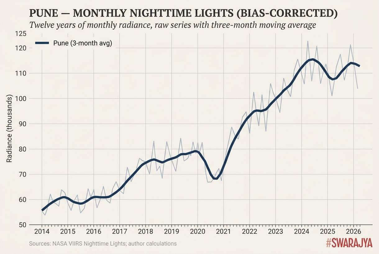
Pune’s twelve-year light curve, against which the methodology was first sanity-checked. The dips between June and September are not economic — they are the monsoon making the satellite unable to see the ground. Even with monsoons stripped out, the smoothed line nearly doubles between 2014 and 2026.
Same shock, different buffers
Same policy shock. Same start date. The trajectories that followed are the question. Why was Leh’s number so much larger across the decade? And why, despite that, is its chart now pointing down?
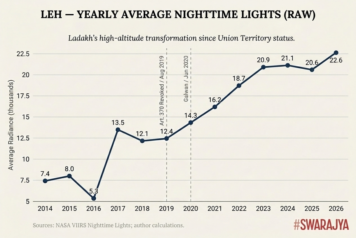
Leh’s climb has two structural drivers stacked into a single line. The 2017 jump is the 220kV Srinagar-Leh transmission line connecting Ladakh to the national grid for the first time. The post-2020 acceleration is the military build-up after Galwan.
Vaidya went back to the building data. The Global Human Settlement Layer tracks permanent built structures. In Leh, between 2015 and 2020, permanent buildings grew 17 per cent. Nighttime light intensity grew 87 per cent. That gap — light expanding five times faster than the buildings recording it is a qualitative signature. The sensor is recording something the building inventory is not.
Two things, in fact.
The first is electrification. Before October 2017, Ladakh was not on the national power grid. It ran on diesel generators. When POWERGRID completed the 220kV Srinagar-Leh transmission line, radiance jumped 138 per cent in a single year. Lights turning on, literally, for the first time.
The second is military. The Galwan Valley crisis of June 2020 triggered the deployment of approximately 68,000 additional Indian soldiers into Ladakh. Each needed food, accommodation, infrastructure. The Border Roads Organisation built access roads at pace. Forward bases. Helipads. Generator-lit supply depots. Tent cities. All of this produces light. None of it appears in a five-year building survey as permanent built volume.
In October 2024, India and China signed a disengagement agreement and Chinese forward troop counts halved. The expectation was that Ladakh’s lights would dim accordingly. They did not, or not in the way pure military drawdown would predict. Ladakh’s power purchase cost rose through fiscal 2024-25, from ₹84 crore in 2019-20 to ₹181 crore in 2024-25. The infrastructure stayed lit.
Leh’s 2025 decline is, on the data, primarily a tourism story, not a military one.
Srinagar’s growth had a different shape entirely. The Smart City Mission put ₹3,634 crore into civilian infrastructure. The USBRL railway — connecting Kashmir to the Indian rail network for the first time — cost ₹37,000 crore and became fully operational in June 2025. A ring road. An airport expansion approved at ₹1,677 crore. Flyover projects. Around 1.88 lakh LED streetlights installed across J&K.
Add it up. Roughly ₹1 lakh crore of central and state investment, concentrated in a metro area of 1.5 million people. That is extraordinary per-capita spending. That is what Srinagar is now built on. The infrastructure does not depend on anyone visiting.
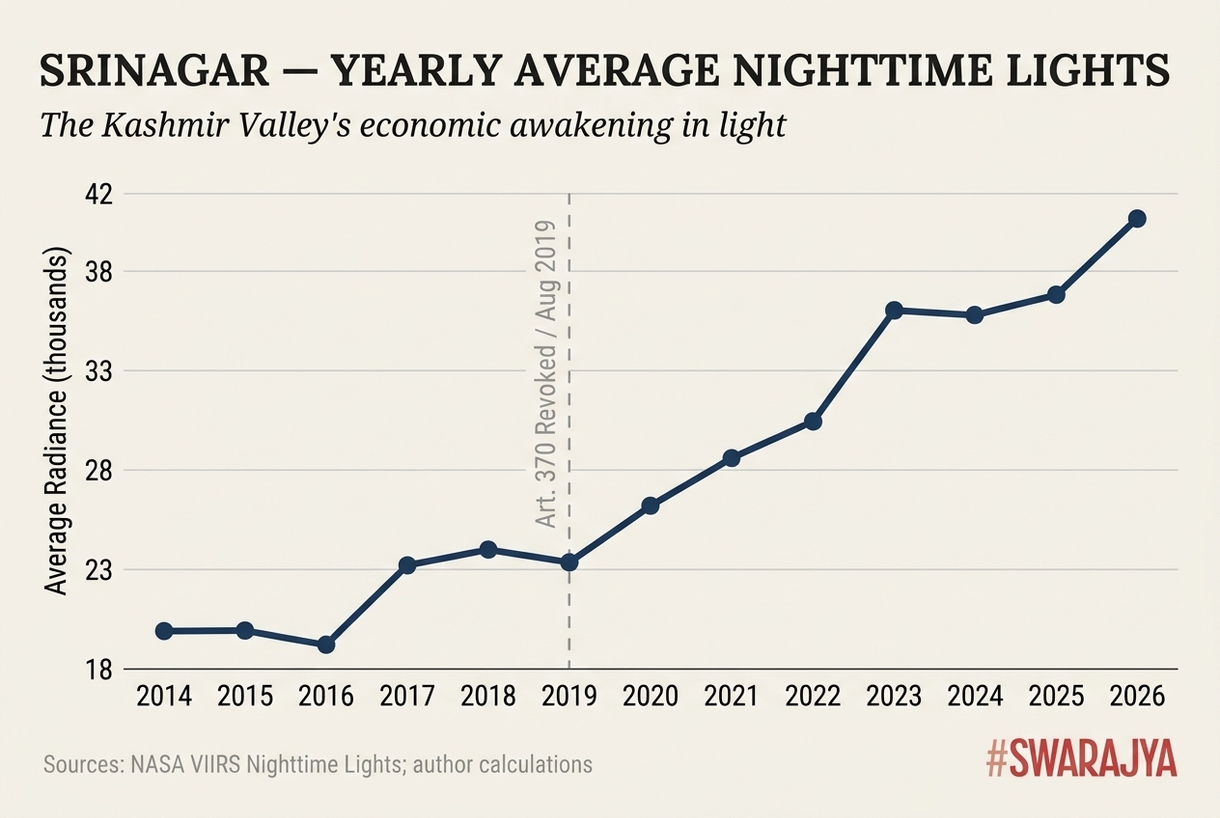
The same Srinagar series at annual resolution. Roughly flat through 2019, then a visible step-change. By 2026, the city centre is glowing 88 per cent brighter than in 2014 — built on roughly ₹1 lakh crore of central and state investment.
The Pahalgam test
In April 2025, radical Islamic terrorists killed 26 tourists at Pahalgam. Kashmir tourism collapsed — down 68 per cent on the previous year. Hotels emptied. The attack was geographically closer to Srinagar than to Leh.
Srinagar’s lights, in the months that followed, barely moved. Down 0.6 per cent from May through December.
What the satellite was photographing over Srinagar at 1:54 in the morning was not tourists in houseboats. It was construction cranes. The USBRL railway. The ring road. Smart city projects.
Roughly ₹5,000 crore of active construction does not pause because tourism drops. The contracts are signed. The machines run.
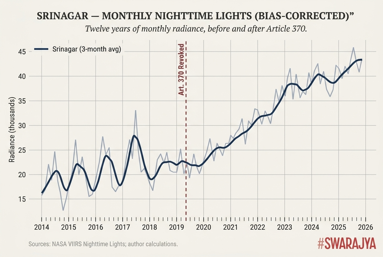
Bias-corrected monthly radiance across the Article 370 policy break. The climb after 2020 is sustained and seasonal. The far-right edge of the chart is where the Pahalgam test sits — 0.6 per cent down from May through December 2025, against a 68 per cent collapse in tourist arrivals.
Leh had no equivalent buffer. Leh’s city centre dropped 9 per cent through May-December. Tourism collapsed across the region. The military was de-escalating at the eastern border. With more than 800 hotels built during the boom and visitor numbers now declining, many establishments were closing. The construction projects that had driven the boom were mostly finished.
Same shock. Same region. Different buffers.
The satellite sees the structural difference because the structure is the difference. Srinagar’s growth is permanent civilian infrastructure. Leh’s was temporary military and construction spending layered on top of the one-time effect of grid electrification.
January through March 2026 hints at stabilisation in both cities — Srinagar up 0.2 per cent year on year, Leh up 1.2 per cent. The immediate shock is being absorbed. The structural gap remains.
Ayodhya
What the satellite can and cannot say becomes sharper still with Ayodhya, where the numbers are larger and the political stakes are different.
Between 2014 and 2022, Ayodhya was a small temple town. Nighttime radiance hovered between 3,200 and 5,200 — unspectacular, what one would expect from a secondary city not yet touched by serious investment.
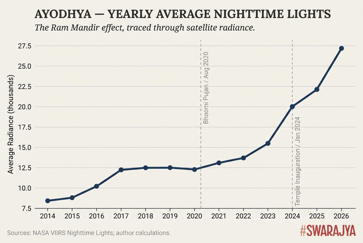
What an entire town being rebuilt looks like from 824 kilometres up. Flat through 2020. Gently rising from the Bhoomi Pujan. Vertical from 2023, when the airport, highway, hotels and commercial development came online together.
Then the chart goes vertical.
By 2025, radiance was 164 per cent above the 2014 level. January through March 2026 was running 20.6 per cent above the corresponding months of 2025. The growth is not slowing.
The timing tells its own story. Progress is visible from August 2020, when the Bhoomi Pujan took place — the line does begin to climb from that point.
The genuinely vertical, hockey-stick growth begins in 2023, when the airport upgrades, highway widening, hotel construction and commercial development came online together. The temple inauguration in January 2024 is the convergence point.
Vaidya also ran the vegetation index and building-volume analysis used for Leh. The vegetation layer showed no significant farmland clearance. The growth was happening inside the existing built footprint — old buildings coming down, new ones going up in the same place. Ayodhya was not eating its agricultural edges. It was being rebuilt from the inside.
District-level GDP at constant prices from the Uttar Pradesh Directorate of Economics and Statistics, five fiscal years from 2018 to 2023, correlates with Ayodhya’s nighttime lights at r = 0.977 — essentially the two measurements telling the same story. Two independent measurement systems agreeing this closely is the strongest cross-check the methodology has produced.
What the satellite cannot say is whether the glow represents economic transformation in the conventional sense. Construction generates light immediately. Construction activity and economic productivity are different things. A new hotel and a building site that has not opened to the public yet look the same from 824 kilometres up.
A city can glow because it is being built, and later glow differently when what has been built becomes active and full of people spending money. Nighttime lights may be a leading indicator of GDP precisely because they register the investment before the economy that investment will eventually create. The satellite sees the future arriving. It cannot tell you how much of it will stay.
Checking the satellite against the books
The risk of trusting the satellite as a standalone oracle is real. Vaidya correlated each city’s nighttime lights against every official economic indicator he could find at or near city level. Nine cities have been studied. Six show strong correlation. The six cross-checks below are the ones the methodology has been most thoroughly tested against.
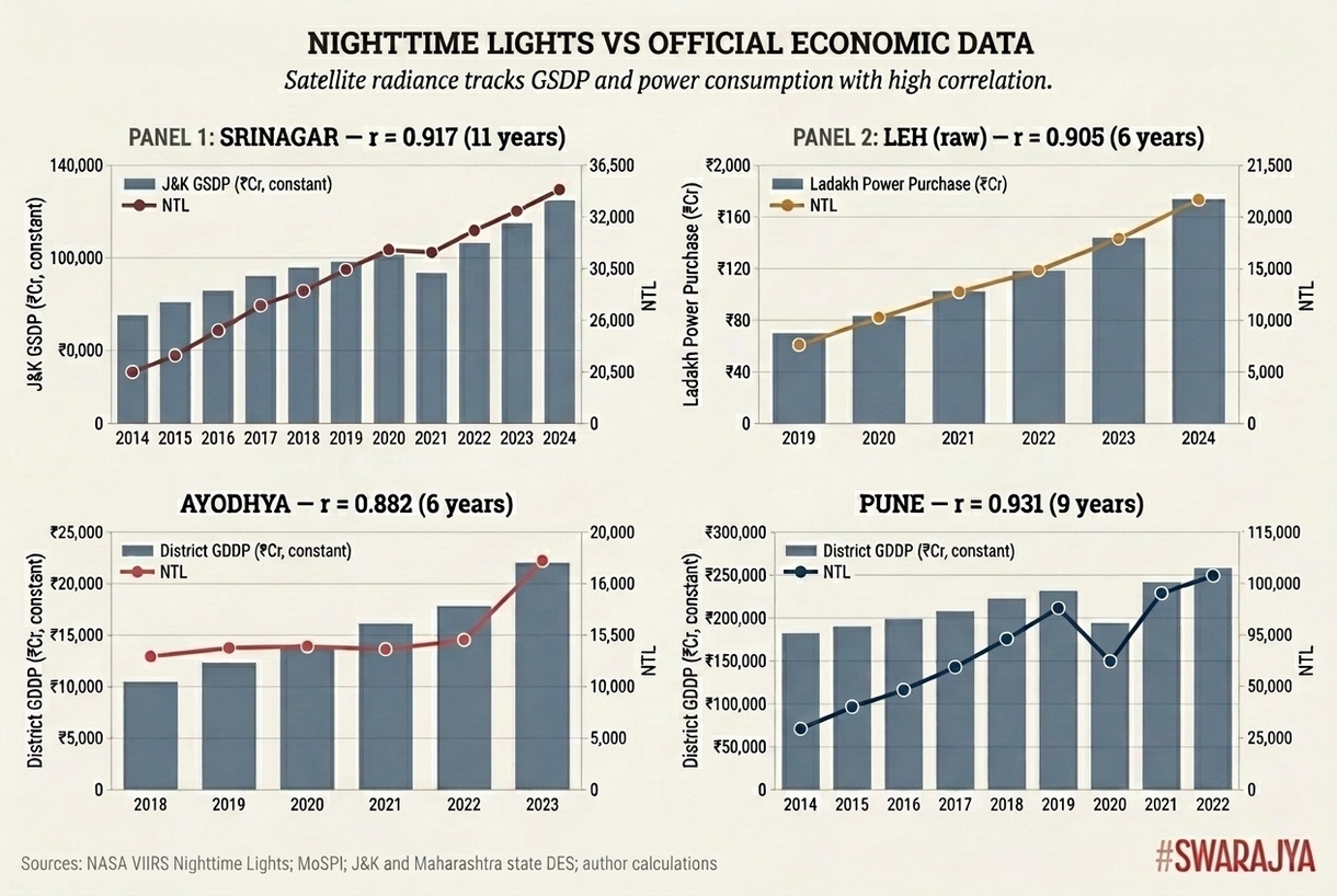
Four cities, four official series, four correlations above 0.9. Where the two measurements diverge in recent years, the lights run slightly ahead of GDP — consistent with construction registering immediately while the economic activity it eventually creates shows up only when projects open. The satellite and the books, where both can be read, are telling the same story.
All six sit above 0.9 — strong by any standard, very strong by most. The satellite and the books, where both can be read, are telling the same story.
City-level GDP is not generally available in India. Vaidya is comparing each city’s nighttime lights against the larger administrative unit it dominates — usually the district or state-level figure. A major city accounts for a disproportionate share of its district’s output, so a strong correlation at city-NTL versus district-GDP implies an even stronger one at the city-GDP level, if anyone were measuring it.
One observation runs through the numbers. Nighttime lights have grown slightly faster than real GSDP in the most recent years. That fits the leading-indicator hypothesis.
What the satellite cannot see
The satellite has two analytical problems specific to India.
The first is the monsoon. From June through September, cloud cover drops usable observations from 11-13 per month to 2-3. Without correction, this introduces a systematic seasonal bias. The xKDR team published a Julia package called NighttimeLights.jl that models the relationship between cloud-free observations and measured radiance, then adjusts each month to what it would have read under clear skies. Vaidya ported the algorithm to Python and uses the corrected numbers throughout. Without that correction, every July-through-September dip in the Indian data would be partly real and partly the sensor being unable to see the ground.
The second is the LED transition. India replaced millions of street lights with white LEDs under the SLNP programme — 1.88 lakh in J&K alone. Counterintuitively, white LEDs typically appear dimmer to VIIRS than the high-pressure sodium lamps they replaced. About 30 per cent dimmer per fixture.
The reason lies in how the satellite sensor works. The VIIRS sensor cannot properly detect blue light below 500 nanometres. But white LEDs emit a large share of their light in the blue range, around 450 nanometres. Older sodium lamps, by contrast, emit around 589 nanometres — exactly where VIIRS sees best.
So when cities replaced sodium lamps with LEDs, satellite brightness readings sometimes fell even if streets became equally bright or brighter. This happened in places like Milan.
India’s case is more complicated because the street-lighting programme also added entirely new lights in many previously dark areas, especially in places like J&K. That can still raise satellite brightness, though less than the actual increase on the ground.
More importantly, these lighting changes are a one-time effect. They cannot explain long-term trends lasting eight years. And since places like Manali also switched to LEDs, the effect partly cancels out in comparisons.
What matters here are the broader trends over time, not the exact brightness numbers themselves.
The harder question
A harder question sits behind both caveats, and Vaidya addresses it directly.
The analysis of Srinagar is broadly positive about post-370 central investment. A different reader could look at the same data and read it differently — what the satellite is capturing is a massive injection of state spending propping up an economy not yet growing on its own.
The reason this question gets pressed on satellite data at all is that the data that would more directly answer it — official figures on local economic activity — is often delayed, unavailable, or, in some contexts, not entirely trusted. That is precisely why nighttime lights have emerged as a standard proxy. Not because they are better than reliable official data would be. Because reliable official data, at the geographical resolution needed, is frequently not on offer.
Organic growth, Vaidya notes, shows up in ways nighttime lights cannot directly capture. GST collections trending upward. Vehicle registrations rising. Private credit growing. The informal service sector expanding as people acquire disposable income. The satellite can tell you a city is being built. Whether the people in it are prospering is a question that requires data which, in some cases, is not yet available at a useful resolution.
Vaidya has not been to either Srinagar or Leh since 2014. He says this plainly, and it matters. The correlations with official data give him some confidence the satellite is tracking something real. But satellite radiance is a proxy, not ground truth. “If you live in these places,” he writes, “your experience is more authoritative than the charts.”
An open question, not a closed verdict
What Vaidya has done is publish everything. Code. Data. Methodology. Hypothesis. As an open question rather than a closed verdict.
Setting up the xKDR methodology from scratch takes a day for someone comfortable with geospatial tools. With Vaidya’s Python adaptation and the included city-level data, it takes one or two hours. The repository ships with the data for Srinagar, Leh, Manali, Ayodhya and the Russia-Ukraine work pre-loaded — the analysis can be run end-to-end without first setting up a Google Earth Engine account. Adding a new city takes four lines of configuration and one download command.
A journalist auditing a government’s development claim. A researcher testing a hypothesis about economic geography. A citizen curious about their own town. All of them can now run the analysis themselves. Start with a place you know, Vaidya suggests. See if the data matches your experience. Then try somewhere you do not.
The case Vaidya would most like someone to run with this toolkit is the one that would test the most consequential of his hypotheses — whether nighttime lights genuinely lead GDP. If construction light precedes the economic output it eventually creates, the timing gap should be measurable against monthly or quarterly economic data at city or district level.
Both MausamNow, Vaidya’s weather tool, and this nighttime lights project are built entirely on publicly available satellite data — IMD radar and global model output for weather, VIIRS for lights — collected and published by NASA and NOAA without an analytical layer on top.
Asked whether this is a deliberate pattern, Vaidya describes it as infrastructure. The data exists. It is correct. It is inaccessible to most of the people who would benefit from it. Not because the underlying science is deficient. Because no one has built the plumbing between the public server and the person with a question.
That plumbing, in both cases, took a few months and a Python installation.
Where this leaves the satellite
The satellite is still up there, photographing the same 500-metre patches every night. Tonight, sometime between 1:30 and 2:30 in the morning over India, it will pass over Srinagar and record the construction sites. It will pass over Leh and record the empty hotels. It will pass over Ayodhya and record a town still being rebuilt.
The question those photographs answer — which cities are growing, which are glowing for temporary reasons, and what the difference looks like from space — is not one the data was originally collected to address. It turns out to be one of the more honest answers available.